 SELF EVALUATION
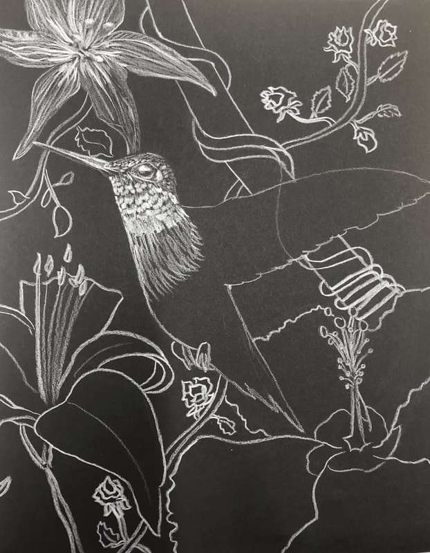
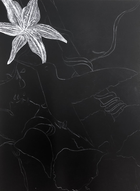
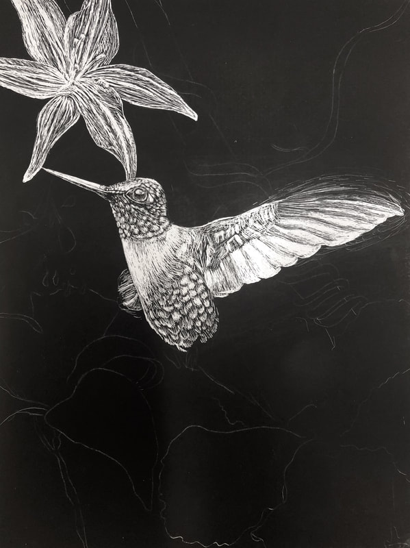
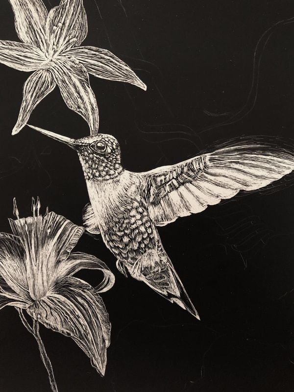
The topic we dealt with for this project was movement. My artwork is displaying movement in nature and how beautiful it is. I drew lots of big and small flowers and a hummingbird in mid-flight in the middle of all the flowers. The meaning in this piece is that nature is always thriving and growing and alive. 2. How did you use textures to enhance your picture? I used very detailed texture on the bird in its feathers and wings to make it very realistic looking and in order to draw attention to it. I also made lots of long texture lines in the flowers ti make them look very intricate and graceful. I made sure to get every vine and vein in each plant. I also made the vines have thick twisting lines to make them look wooden and different. 3. How did you balance your artwork and create a well-organized composition? I balanced my artwork by making a background of a few large flowers and then some vines in the top corner. I also put little flowers and leaf vines in the empty space to add balance while not making it too crowded. Then I put the hummingbird in the center of the drawing and I made it the brightest most detailed part of the piece in order to make it the main focus point. 4. How did you imply movement in your drawing? I implied movement in my drawing by drawing the hummingbird in mid-flight so that the wings were fluttering quick but graceful. I also made the flowers appear like they are growing and thriving by drawing large petals pointed upwards. I also drew curling, twisting vines weaving in and out throughout the drawing. I think I did a really good job implying movement in this piece because when you look at it, your eyes move throughout the drawing following the twisting vines and the living flowers. 5. How could you improve your artwork? I could improve my artwork by making the bottom right flower more bright and adding more detail to it because it's kind of a dull part of the drawing. I also could have done a little less highlights on the top left flower and spent a little more time focusing on where the shadows were. 6. How did you demonstrate a wide range of shading values? I demonstrated a wide range of shading values by leaving black space between each feather in the hummingbird. Also, in the flowers I focused on the highlights between the creases and veins in the petals and made the center of the flower get gradually darker to show that it is a shadowed spot where it goes deep.
0 Comments
   Evaluation
1. Describe the craftsmanship of your drawing. (Is it neat and well executed?) My drawing is neat and well executed. Except for a couple of smudge marks here and there. 2. Describe how your background choices help unify the three artworks and tie them together as one piece of art. My background choice is just a white counter and wall which unifies these objects by putting the focus on them. 3. Describe your choice of colors/color harmonies and how you used them throughout the artwork. I used a light color (orange), a darker color (red), and a very dark color (blue and brown) to add different contrasts. It makes the drawing more appealing. 4. How did you create contrast in your drawing? I created contrast in my drawing by adding shadows behind the objects and shine marks on the plastic containers. I also shaded the apple with multiple layers of red and dark purple in order to make it look more realistic. 5. How did you use textures, highlights and shadows to enhance your artwork? I made the plastic look smooth and crinkled. I used highlights on the bottles where light was shining and used shadows in the creases and behind the objects. I also put highlights on the caps of the bottles and made them darker towards the bottom. 6. Why did you choose a particular background color to mount your artwork? My background is tan because I wanted the main focus to be on the objects, and tan is a light color that would be easy enough to make with see through objects. 7. Discuss the importance of understanding the media (prisma or pastels) and acquiring the skills necessary to create a successful project. You have to understand how to use pastel pencils because if you press too hard or can't blend well, it looks sloppy. Also, it is important to know how to blend colors with pastel, especially in the apple, to know how to make the drawing look 3-D and realistic. 8. Describe any difficulties you had creating your drawing and what you could do to improve your drawing? I had difficulties getting this drawing started. I didn't think it was going to be good so I had little motivation to get me going. I could've improved it by taking more time to make the shine marks stand out more on the orange juice container. I also could have made the orange juice and soda look darker and more like a liquid. And I got lazy with the background. 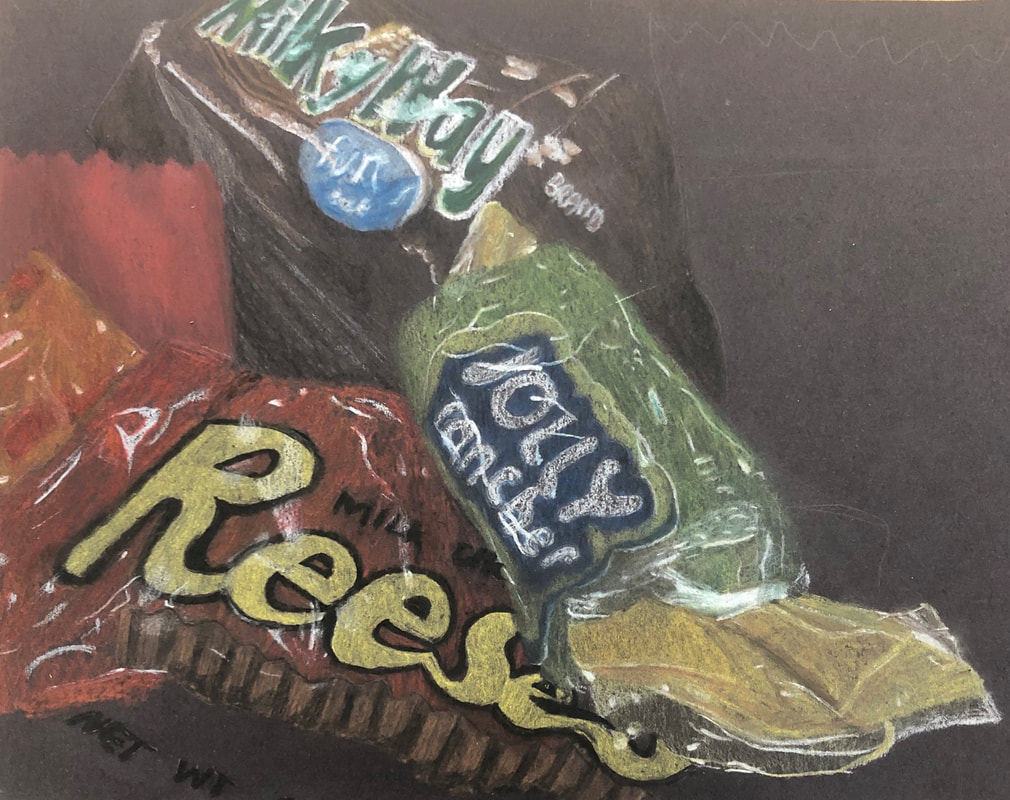 This is a drawing I did of a few pieces of candy. I used pastel pencils and used the white to make the shine marks before putting color down. Last, I used the dark brown/black to make shadows.  This is a drawing I did of a jolly rancher and smarties. We were focusing on capturing the shine marks and transparency of plastic wrappers. I got pretty lazy with the jolly rancher and lost patience and did not want to finish.  I drew a mint wrapped in a plastic wrapper. I only used a white pencil to show all the creases and shines on the wrapper.

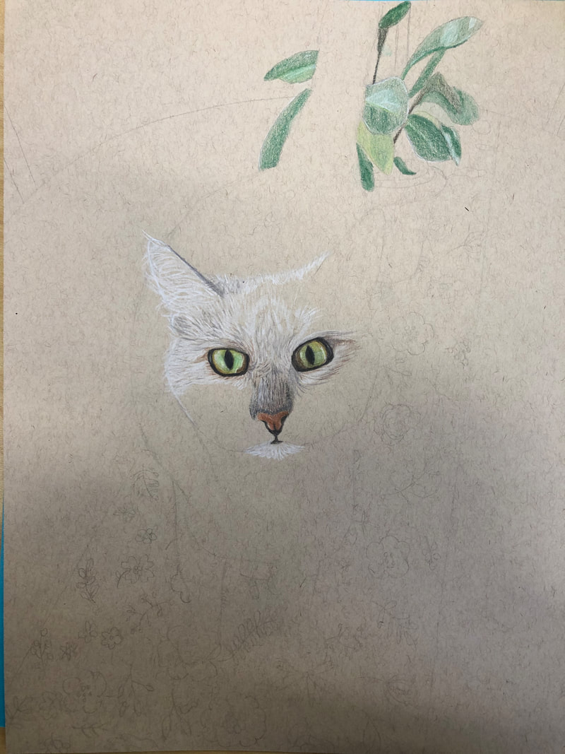
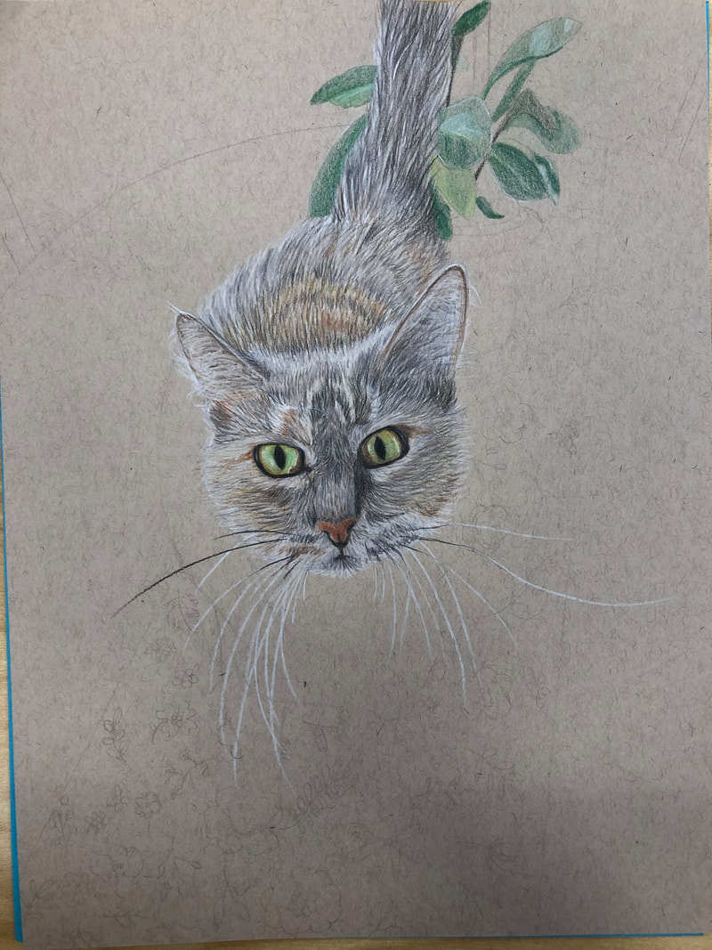
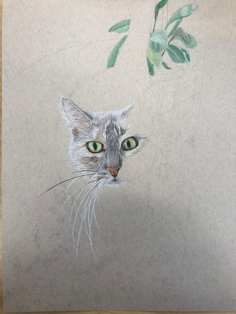
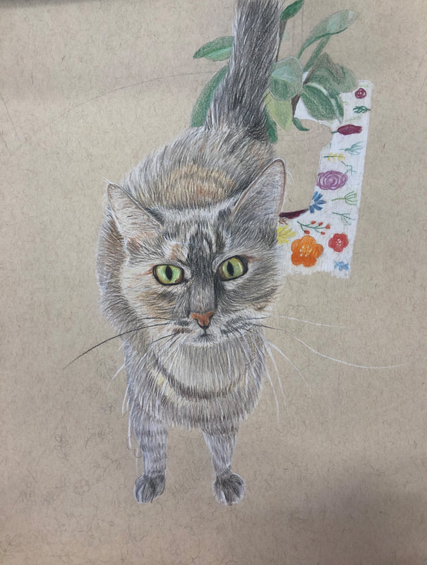
 1. Describe how you created an interesting point of view? Was it successful? Why or why not?
I created an interesting point of view by taking a picture of this cat from above. I think it is pretty interesting because the cat is looking up at the camera, its body going out behind it. Also the table cloth is stretching back and getting thinner the further away it is. 2. Why is it important to understand perspective and how to draw it? It is important to understand perspective and how to draw it because it adds depth and dimension to flat drawings and makes it look more realistic and 3D. 3. How were the colored pencil exercises important in the success of your piece? The colored pencil exercises were very important because they allowed me to get more comfortable with layering the lightest colors first and adding in darker ones. I also practiced texture and fur. These exercises allowed me to have patience during my final piece and really focus on it. 4. Describe the craftsmanship of your colored pencil. What techniques were used? (How well the project is technically crafted). I used techniques like layering light colors before dark, short individual lines to create a fur texture, and leaving some parts white to add shine/light source areas. I also used dark colors to create shadow/contrast. 5. Were you able to achieve depth by showing a foreground, middleground and background? Explain. I was able to achieve depth because the foreground was the cat, which I spent the most focus and detail and time on in order to show it was closest to the camera and the main focus. I made the middle and background a little darker and less detailed and added shadows behind the cat and objects in the middle ground. 6. Explain your experience with colored pencil and the project in general. What were the obstacles and advantages There were definitely a lot of obstacles with learning how to draw with colored pencils. It was very hard for me to take my time and really be patient, especially when layering colors. However, I learned a lot and I really enjoy using colored pencils now because I know how to make realistic drawings and it's fun. 7. Looking back on the progression of this project what skills, techniques or other information would you like to have been taught? Do you feel you were prepared for this project? I wish I was taught how to draw smooth surfaces because the table in my drawing looks awful. Other than that I feel like I was very prepared for this project and I am happy with the outcome.     These are the progress photos and final photo of blueberries I drew with colored pencils. You can see how I started with the lightest color and gradually layered over darker colors and then added white to show shine marks. I also added dark colors where shadows were.     
2. Are your values and shadows realistic? How many values did you include? How and why are values important? The values and shadows are realistic. I included around 5 or 6 values. Values are important because it shows how light and dark each object is, and adds contrast to drawings. If everything were just the same shade of darkness, we wouldn't be able to tell which objects are behind the other or where there is a shadow. In this way, value also adds a more 3-D look. 3. Is there a clear source of lighting? It may be a little hard to tell but it is clear there is a source of lighting on the left side. 4. How important were the compositional sketches? Explain. The compositional sketches were very important because they allowed me to see which would be the best drawing to do based on defined space. 5. How is your final drawing successful? My final drawing is successful because it looks really realistic. I did a good job of showing texture and blending. I also added shadows where they needed to be and highlights in the right places. 6. Are the proportions, structure and perspective of the subject correct? The proportions, structure and perspective of the subject are correct. 7. Does the placement & grouping of objects create a pleasing arrangement (composition)? I think the placement and grouping of objects in this drawing did create a pleasing arrangement. 8. Is there a center of interest and is it well located? Yes, the center of interest is the hat on the stuffed cat. It is well located because it is almost in the center of the picture and is towards the top, keeping the attention on the whole drawing. 9. How well did you manage your time and resources throughout the process of creating this drawing? Do you see where you could improve in this area? I did not manage my time very well because the first two days I barely got anything done. I used a few pencils, blending tool, and a kneading eraser so I made good use of my resources. I could improve on having the mindset to get things done because I kept taking breaks because I was scared to go further and mess things up. 10. What challenges did you encounter during this project and how did you overcome them? It was challenging to have the patience to do this drawing. I just wanted to get it done and I didn't feel like doing it. But I overcame this by pushing through and focusing and spending time on detail without going super slow. 11. What have you learned drawing a still life? I've learned a lot about how to correctly shade and add texture to any type of object. I also learned where to put shadows and highlights and how to make a drawing look pleasing to the eye. |
AuthorHannah Smith, 10th Grade Archives
January 2020
Categories |


 RSS Feed
